
The fundamental purpose of a company website is to provide information. So, it might seem as if the more information your website provides, the better of a job it’s doing serving your company’s interests.
Studies of consumer behavior, however, including time spent on-page and conversion rates, indicate this is not actually the case. Instead of making it seem more informative, more information per page can make a website appear cluttered, which reduces readability and may have a negative impact on your company’s bottom line.
Below are some ways you can decrease clutter on your website and increase conversions.
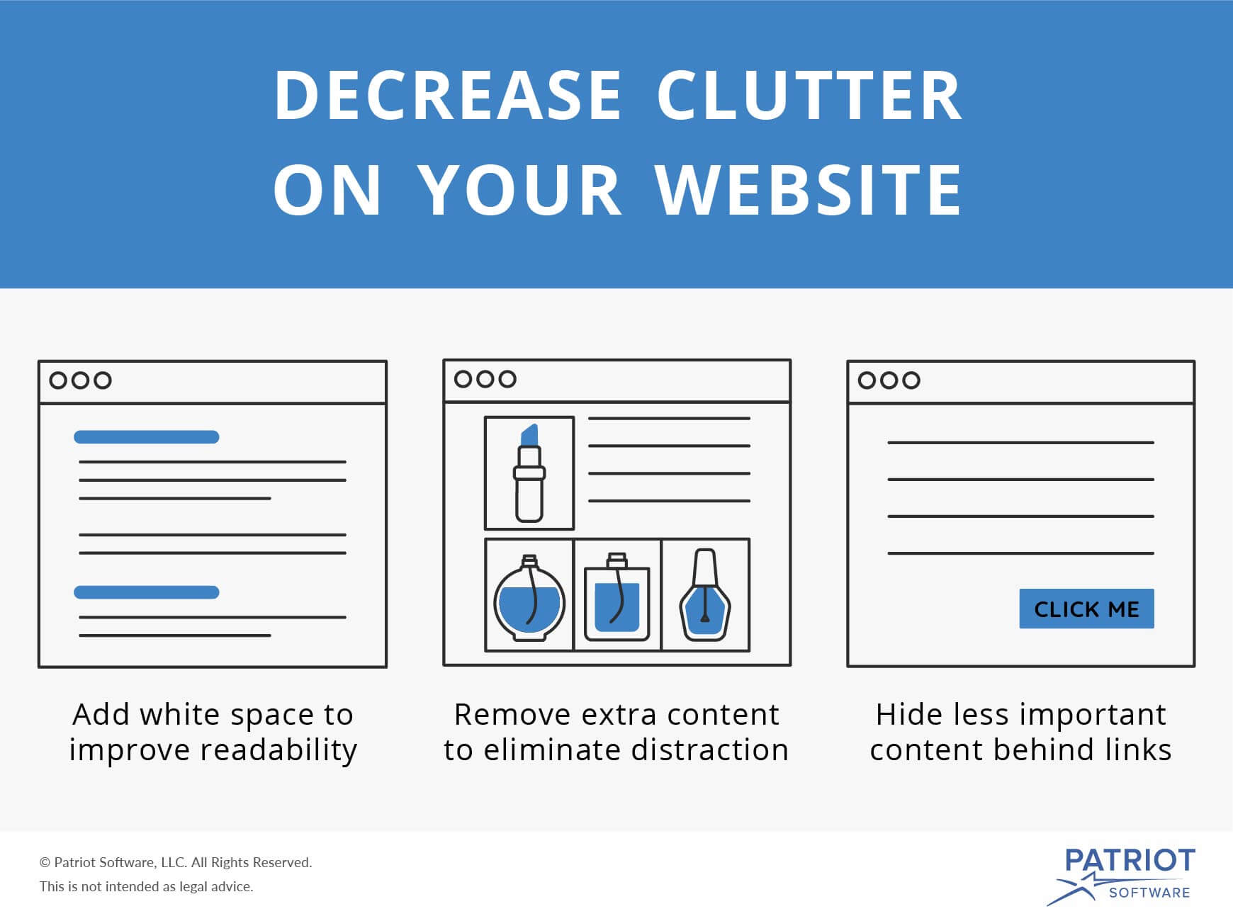
1. Add white space to improve readability
Most people would agree that enough white space in print books and periodicals is essential for readability. This understanding has led to a few best practices involving font types, sizes, and pitch that print designers can lean on during the design process.
The same holds true for digital media. While the results of some studies have provided insight as to the exact range of white space that creates the ultimate readability when it comes to web page design, you don’t have to pull out a calculator to utilize the power of white space. The adoption of good white space practices already factors into many of the trends we use in web design.
White space in action
Relatively short paragraphs, heading tags that separate section titles from article text, and spaces between paragraphs—instead of indents—all contribute to a page’s white space.
This is, of course, on pages like this one, which require a substantial amount of text to serve its purpose.
On non-article pages that serve more as a directory, a reduction in text and clear divisions between parts of the page enhances white space and makes the page more readable.
2. Remove extra content to eliminate distraction
The information on each page of your website is important. It helps visitors make an informed decision about whether they would like to work with your company or whether the product you’re advertising is the right one for them.
Too much content, though, can have an alternative effect. It can obscure the most important information on the page, confusing site visitors into not knowing what they’re supposed to do next and reducing conversions. This is true even in studies of retail sites. Basically, the less information users must sort through to make their decisions, the more likely they are to buy.
Additional products ARE extra content
When you’re a business owner, especially in retail, it is always tempting to upsell. Selling more (or more expensive) products, after all, goes right to your bottom line, increasing your company revenue, and allowing you to invest in expansion or whatever small business growth strategies you want to pursue.
This is why many companies use additional space on a product page to advertise related products and other potential add-ons. It’s sort of like the checkout lane at a grocery store. Sidebars and the bottoms of pages seem like good spots to dangle impulse purchases in front of already interested buyers.
The reality is this type of add-on advertising may be backfiring on retailers. Some studies of online stores have shown that customer purchases actually increase when these additional product pitches are removed from product pages. While there is limited information as to why users tend to purchase less when they are shown more products, two possible culprits are distractions and not being able to make a decision.
3. Hide less important content behind links (or tabs)
There is no question less is more in web design. But that doesn’t mean getting rid of excess information on a webpage is easy. It can be hard to know which information is essential and which information is extraneous, so here is the most important piece of advice when rethinking the design of your company website:
Any content that does not lead a visitor to take the action you wish them to take on a page (e.g., buying a product, signing up for your newsletter) is extra content.
That doesn’t mean the content is unimportant. It just means most visitors to your website won’t need the information to make a decision about whether to buy, sign-up, donate, etc.
Less essential content, such as product specs, reviews and the like can be hidden behind a link, or, more commonly in current design trends, behind a tab or further down the page. As long as these links or tabs are clearly marked, those visitors who are interested in reading more in-depth information about your product or service will able to find it, without any negative impact on page readability or conversion rates.
These views are made solely by the author.